Visual Minute Papers from #PODHBCU
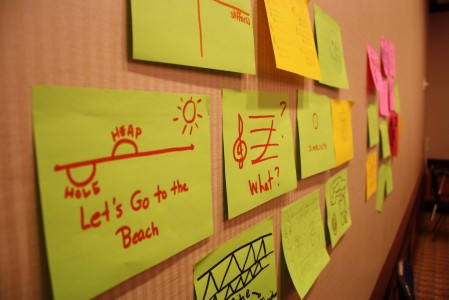
At the end of the “Everyone’s a Visual Learner” session that Jose Vazquez and I facilitated in Atlanta last month (see recap #1 and recap #2), we asked participants to create “visual minute papers” in which they doodled their ideas for using visual thinking in their teaching. Jose and I passed out 5″ x 7″ Post-It notes and dozens of markers, then gave participants five minutes or so to document their ideas.
We asked them to post their visual minute papers on the walls of the session room when finished, giving them a chance to see each other’s ideas. Had we decided to spend more time on this activity, we might have had participants group their Post-It notes using some set of categories and/or asked a few participants to share their ideas verbally with the room.
You can see all the visual minute papers over on Flickr: group #1, group #2, group #3, and group #4. Below are a few of the minute papers that struck me as particularly interesting. We didn’t ask people to put their names on their minute papers, so I can’t provide attributions for these. But if you were responsible for one seen here, please let me know in the comments.
The first few describe ways to teach a particular bit of content.
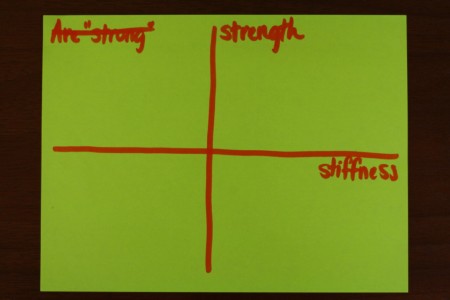
From what I know about strength and stiffness as material properties, I can see how this set of coordinate axes could be a useful tool for teaching students about these properties. It’s easy for students to see strength and stiffness as highly correlated. (This of a steel beam.) However, if you ask students, “In which quadrant would you place a rope? Or a cookie?”, the conceptual differences between these two properties should become clear.
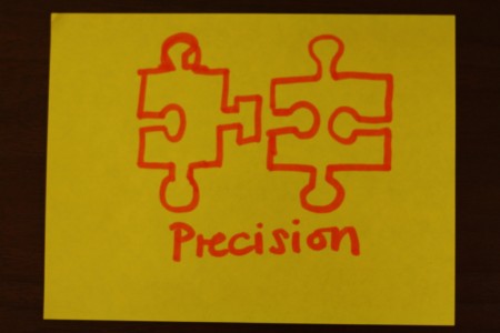
Want to talk about the need for precision in some particular context? Show students an image of two puzzle pieces that don’t quite match. This is a nice visual metaphor, and I can see it being extended to talk about the difference between precision and accuracy, perhaps.
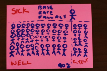
The last time I taught the base rate fallacy in my stats course, I hadn’t yet got the visual thinking bug. I wish I had, however, because it’s clear from this visual minute paper that visuals can go a long way toward clarifying this idea! Let’s say you have a disease test that is 90% accurate. That is, 90% of the time it accurate reports whether or not an individual has a particular disease. If this test reports that you have the disease, what’s the probability that you really do?
Take a look at the diagram above. Most people do not have the disease, which is why there are so many people below the horizontal line. But 10% of these healthy people will have a positive test result; those are the people in the lower right quadrant. Of course, 90% of those with the disease will test positive (that’s the 90% of a person in the upper right quadrant), but if you look at all those who test positive (that is, all the people to the right of the vertical line), you’ll see that most positive test results are actually false positives.
Brilliant visual thinking.
The next few visual minute papers I’ll share focus not on content, but on process.
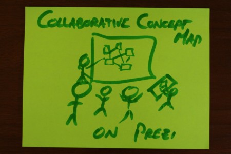
During the session, I described my use of Prezi Meeting to have students collaboratively create a debate map, as well as Georgetown University sociologist Sarah Stiles’ use of Prezi Meeting to have students collaborate on a timeline for major characters in a book they read. I guess someone in the workshop liked this idea!
During the session, Jose talked about the ease with which many of us can take photos that serve particular pedagogical purposes. I think this visual minute paper gestures to that idea, perhaps extending it to the idea of having students take photos as part of learning activities. One of my favorite examples of this is David Silver’s “Green Media” assignment, in which he asked students to bake something for breakfast and illustrate their process via photos shared on Flickr.
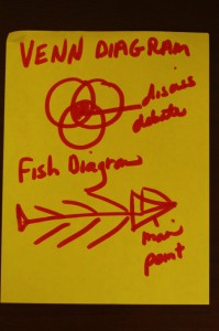
When you put these two diagrams next to each other, it’s clear that they work in different ways. The Venn diagram is a way to visualize concepts and properties; the fish diagram is a way to visualize arguments in support of a thesis. I’m pretty sure that’s what this workshop participant meant, but I wondered upon seeing this minute paper if “fish diagram” was an established visual tool. It is, but not as this participant used it. A “fishbone diagram” (or “Ishikawa diagram“) is a quality control tool used to show causal relationships, usually those between certain kinds of inputs in a given process and a particular unsatisfactory output. It’s a pretty handy analysis tool that I’m very glad to know about!
These last two minute papers are a bit more meta, but well worth considering.
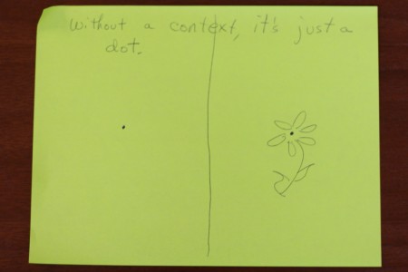
“Without a context, it’s just a dot.” With context, it might be the center of a flower. This is a useful reminder that when we use images, it’s important to discuss their contexts.
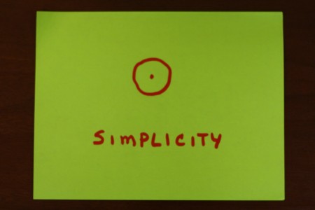
Jose and I are fans of Garr Reynolds’ Presentation Zen approach to presentations. Reynolds emphasizes the importance of simplicity in one’s visuals, and I think this minute paper captures this idea elegantly.

