Infographics, Rubrics, and a Seated Poster Session
A few weeks ago here, I wrote about a rubric for evaluating infographics that my students helped design. That rubric was created in service to the final application project in my spring stats course. Students used the statistical techniques they learned this semester to answer questions about “real world” data sets, then communicated their results via infographics. The infographics are complete now and are available over on my course website. I thought I would follow up on my earlier post about the rubric and describe the rest of my process for this assignment, including the “seated poster session” that wrapped it up.
First, a recap of that earlier post: I asked students to find and share examples of good infographics. Then they identified aspects of effective infographic design (organization, use of color, data visualization, and so on) and drafted descriptions of different levels of quality (poor, acceptable, good, excellent) for those aspects. I used their suggestions to design a draft rubric, which they used to evaluate a couple of sample infographics. This gave them a chance to think more concretely about the qualities of effective infographics, and gave us all a greater shared understanding of those qualities.
What’s happened since then? I took the draft rubric and refined it, yielding a more-or-less final version that I’ll use to grade the students’ infographics. Here’s the result:
The first page is similar to rubrics I’ve used for this assignment in the past when the student product was a five-page paper. It’s the second page that is all new, featuring some visual thinking standards (spatial relationships, colors, text), a little info literacy (sources), and a couple of more holistic categories (organization, aesthetics). This isn’t an entirely objective rubric, particularly when it comes to aesthetic appeal, but I don’t think a little subjectivity can be avoided in this genre.
I distributed this version of the rubric to the students so they would know what I was expecting for their infographics. I also provided them with some resources for creating infographics, some suggestions for finding and using Creative Commons images, and answers to several frequently asked questions about the assignment.
Then the students went to work, with relatively little assistance from me along the way. I helped a few groups with questions about statistics and about R (the statistical software we’re using in the course), and one group had to ditch their original project idea when it became clear they couldn’t get the data they needed. They took on a project proposed by another group of students, a process made easier by the fact that all of the project proposals had been posted to the course blog. Other than these interactions, the students worked on their own, producing some very impressive infographics. I’ve included a few below as examples, but all of the infographics are on the course blog.
 In past offerings of this course, I’ve organized a student poster session on the last day of class, giving students an opportunity to see the good work of their peers. This semester, however, the fact that I have 70 students and a pretty small classroom meant that a traditional poster session wouldn’t work. Instead, we had a “seated poster session” in which the students were stationary and the posters circulated around the room.
I told the students that if they submitted their infographic to the course blog at least an hour before the final class, they would be eligible for “prizes” (extra credit). Most of the infographics were turned in before this deadline, enabling me to spend the morning before the last class printing 11″ x 17″ copies of the students’ infographics. Only three of the infographics translated poorly to this format: two that were very long and skinny and one that was submitted as a Prezi. The rest turned out great.
I made two copies of each infographic and brought these to class along with copies of a checklist of all the infographics and voting forms. I asked the students to take a look at all the infographics by passing the hard copies around, taking notes on each for the purposes of voting in three categories: Most Interesting Application, Best Data Visualization, and Most Attractive Infographic. The next 35 minutes or so were productively chaotic, with students viewing, discussing, and passing around the infographic “posters.” I took a few photos of the chaos, which you can see here in this post. Most of the students were highly engaged in this process, making many lively comments about the infographics their peers designed.
The poster circulation got a little challenging near the end of the viewing time, as each student’s list of unseen posters got smaller. My TA and I did what we could to help students get the posters they needed to see, first by calling out the numbers of posters that were not being used by students, then by asking students for the numbers of the posters they needed to see and trying to track down copies of those posters. This worked well enough, but was challenging to do with 24 posters and close to 70 students in the room.
Another challenge I didn’t expect was counting the votes once they were in. I had students submit votes in writing, as I’ve done in past poster sessions. Counting nearly 70 votes in three categories, however, took more than the ten minutes I had given myself at the end of class to do so. I had to announce “contenders” in each category as class ended, then finish counting and post results on the course blog shortly after class. Next time I’ll either use clickers for the voting or have a plan in place for my TAs to help count.
During the poster session, I also asked my students what software they used to create their infographics. I had suggested they use R or Excel to create data visualizations, and then insert those charts and graphs into a PowerPoint or Prezi. I also mentioned Visual.ly, a free online tool for creating infographics, letting the students know that I hadn’t used the tool myself but that it looked promising. Below are the tools they actually used, with usage rates in parentheses.
- Excel (66%)
- PowerPoint (51%)
- Photoshop (41%)
- Paint (38%)
- Google Docs (21%)
- Illustrator (16%)
- Matlab or Mathematica (5%)
- Gimp (5%)
- Prezi (3%)
Not listed above is R, since I had taught them how to use R, and I was more interested in finding out which programs the students used that I hadn’t taught them. Also, this was a multiple-mark clicker question, and I wasn’t sure how such a question would handle two-digit inputs!
You’ll notice that the numbers above add up to more than 100%. Most students used two or three programs for their infographics, with some students using four or five different pieces of software. The Excel + PowerPoint combo was popular, sometimes with the lowly Windows Paint program in the mix. Excel + Photoshop was popular, too. One group used Photoshop + Illustrator + Google Docs + Excel + Matlab, and the Prezi group also used Illustrator + PowerPoint + Excel + Paint.
Before I share the winning infographics, I’ll share one more anecdote related to this assignment. One of the groups ran the numbers on a set of resistors from Joe Knows Electronics for their project. The group had purchased the resistors for use in their senior design project. Shortly after their infographic went live on the course blog, Joe, the founder and CEO of Joe Knows Electronics, left a comment on the blog post praising the students’ work and providing some information on the company’s quality assurance practices. One of the students in that group told me about the comment from Joe, and then left a response, linking to a video of Joe’s resistors in action at the School of Engineering Senior Design Day. Authentic audiences in action!
Without further ado, here are the winning infographics, as voted by the students themselves.
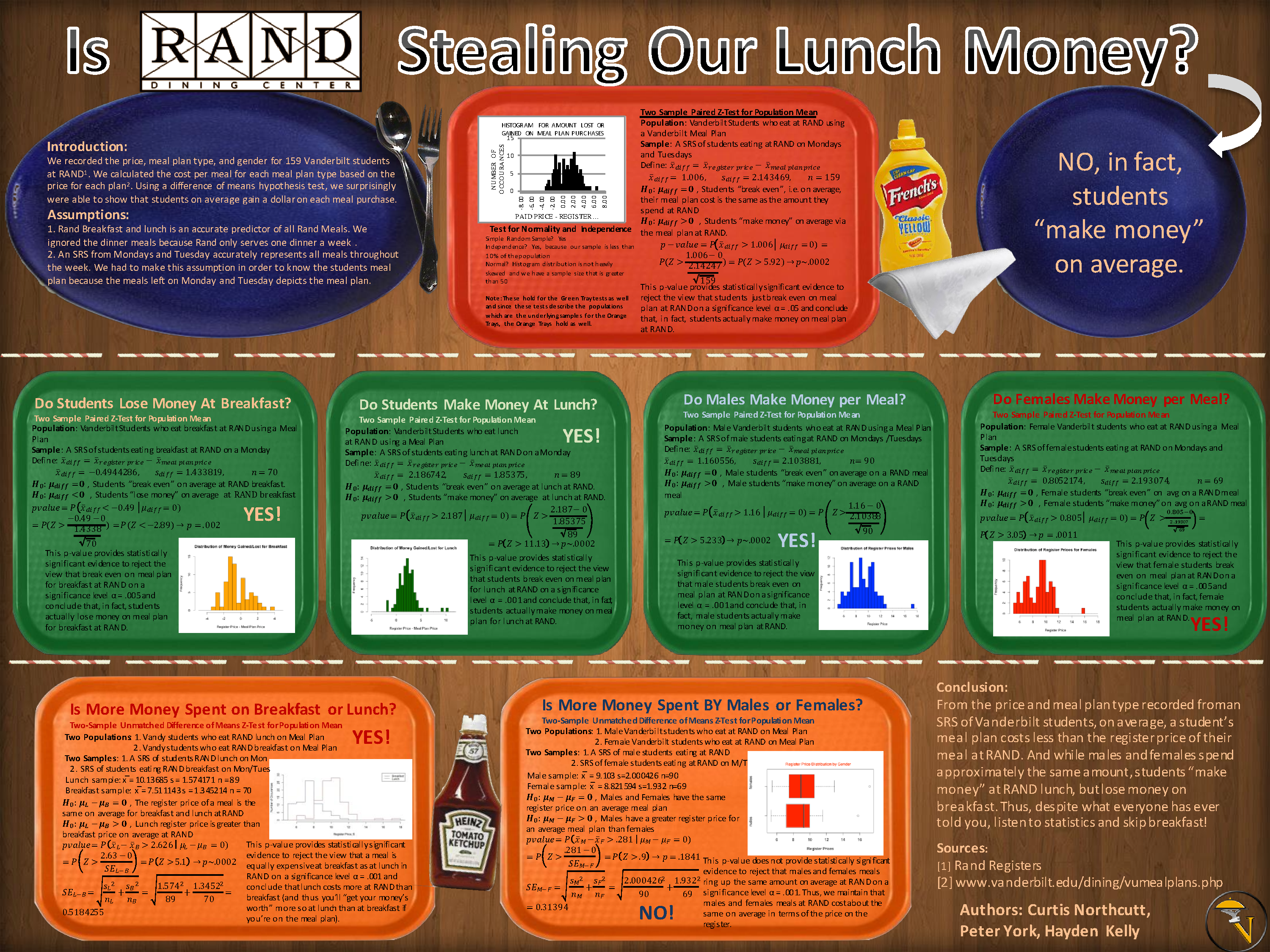
Most Interesting Application: “Is Rand Stealing Your Lunch Money?” (Click on any of these to see larger versions.)
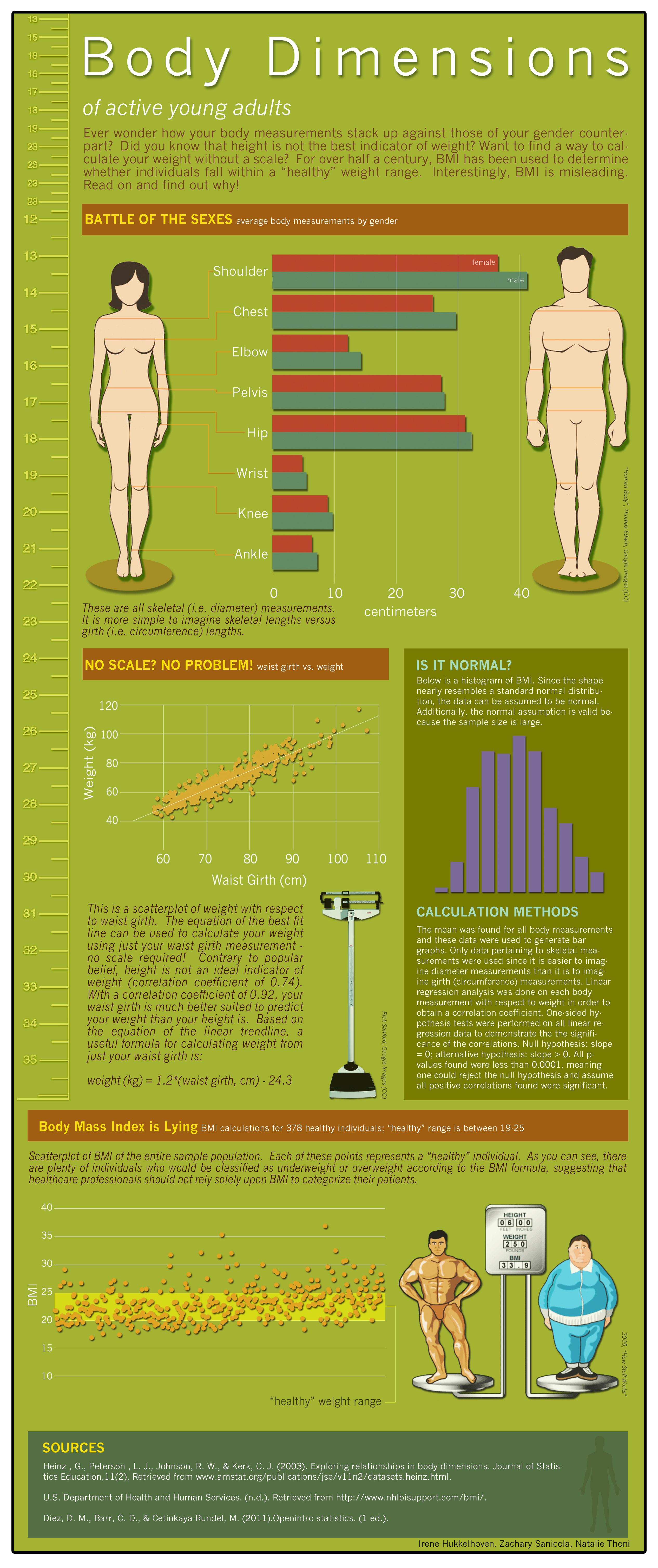
Most Attractive Infographic: “Body Dimensions of Active Young Adults”
Best Data Visualization: There was a three-way tie in this category. One of the winners was “Body Dimensions of Active Young Adults,” seen above. The other two were “Do Baseball Salaries Influence Playoff Births?”
and “SAT Scores by State”
I hope you’ve gotten something out of this very long post. If nothing else, I’m glad for the chance to brag on my hard-working students!


