Timelines, EdTech, and Thin Slices of Student Learning
 This year the Vanderbilt Center for Teaching is hosting a few educational technology working groups for faculty, staff, and students interested in exploring ways particular technologies might meet their instructional goals. One of those groups is investigating digital timeline tools, like Tiki-Toki and TimelineJS, that facilitate the creation of online, multimedia, interactive, and collaborative timelines. The group had its first meeting of the spring semester yesterday, and the conversation got me thinking about educational technology and “thin slices of student learning,” a term I picked up from Randy Bass. But first, a bit of context…
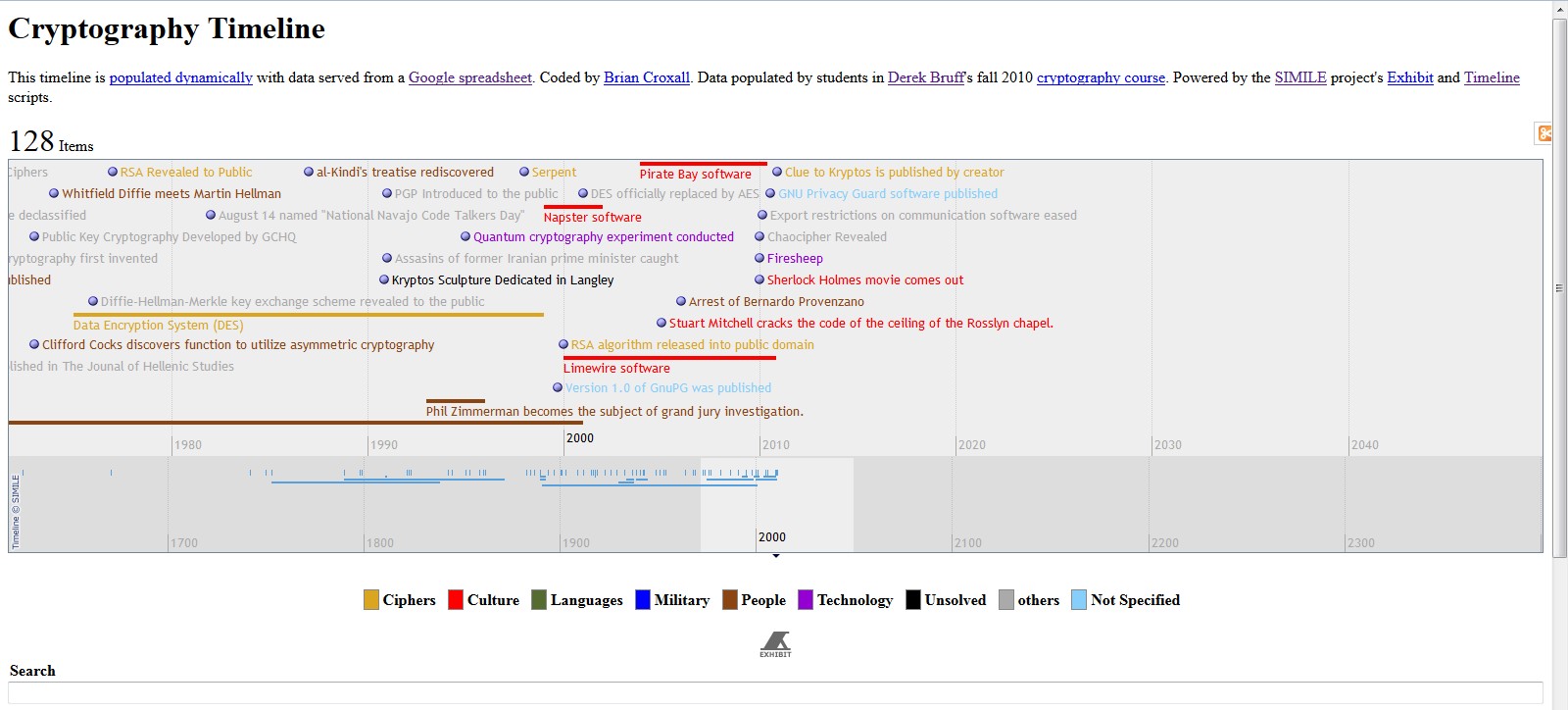
I first heard about digital timeline tools from Jason B. Jones, who had his students build a Victorian Age timeline back in 2008 using Google spreadsheets and the Timeline script from MIT’s SIMILE project. Jason worked with Brian Croxall on the project, and Brian put together a helpful tutorial for others interested in building collaborative timelines. In 2010, I taught my cryptography seminar, which focuses on both the mathematics and history of cryptography, so I experimented with a collaborative timeline assignment. You can see the live results here. (Screenshot below.) The timeline is dynamically populated from a Google spreadsheet, which allowed all of my students to contribute entries to the same timeline. The experiment was a moderate success — we ended up with 121 entries and some of my students reported the timeline as helpful in seeing connections among course material — but there was room for improvement, as I noted here on the blog in 2011.
 Flash forward to 2015. The Center for Teaching launches its timelines working group, and I was teaching my cryptography seminar again. This time, I asked my students to improve the timeline that my 2010 students created, by adding new entries and polishing some of the existing entries. Practically, this was pretty easy since the timeline is fed by a Google spreadsheet. I just invited my students to edit the spreadsheet. Conceptually, the work was a bit harder, but I gave the students more specific instructions this time around regarding their timeline contributions.
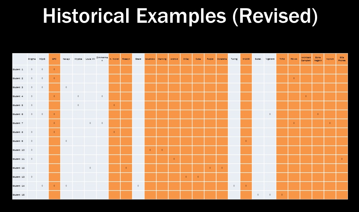
One of the problems in the 2010 timeline assignment was that I didn’t ask students to analyze their collaborative timeline in any significant way, so in 2015 I added a paper assignment that did just that, an assignment that asked students to identify “lessons learned” from the history of cryptography for those interested in keeping secrets. The resulting student papers were strong. Well, the revised papers were strong, after I showed the students just how few of their historical examples came from a source other than our textbook. See the chart below. Grey columns are examples we had discussed at length in class. Orange columns are examples students found by looking through the timeline or other non-textbook sources.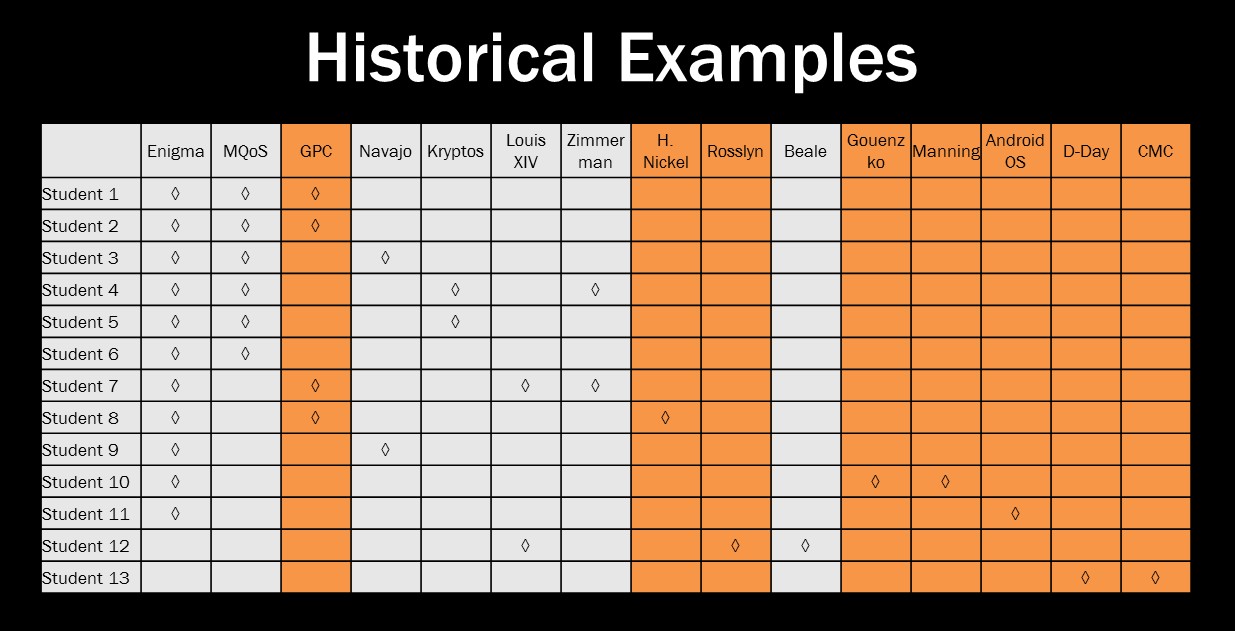 After my encouragement to look a little more for relevant examples, the students revised papers did a much better job of going beyond the textbook for sources:
 The first round of papers discussed 26 examples we had already discussed (counting repeated examples across papers) and 11 we hadn’t. The revised papers featured 27 “known” examples and 26 “new” examples — a dramatic improvement!
Student feedback on the timeline tool, however, was mixed. In my end-of-course survey (the one I ran as a supplement to the standard Vanderbilt course evaluations), students rated the timeline as more useful than the social bookmarking via Diigo they engaged in, but less useful than writing for the course blog and working through problem sets. One student wrote the following:
“I especially enjoyed using the collaborative timeline when writing the ‘Lessons Learned’ paper because it offered a variety of cryptography examples I probably wouldn’t’ve discovered otherwise. I was able to pick which examples were the most interesting to me which made writing my essay much more enjoyable.”
But most students said that the utility of the timeline was limited, mainly because the visualization was hard to navigate and search. That was a very interesting comment, because earlier in the semester I offered students the choice to stick with the original 2010 visualization or switch to using TimelineJS, a tool based on the SIMILE code but with a different look and feel. The students picked TimelineJS, but seemed to regret that choice later in the semester. You can judge for yourself: Here’s the original 2010 timeline again, and the 2015 timeline in TimelineJS.
 Okay, that was more context than I had planned to include. But these timeline assignments are fascinating, which is why I wanted to host the working group to begin with. Notice how my analysis of the examples students included in their first-draft “lessons learned” papers gave me some insight into how students were working with sources? I’ll use that observation as a segue…
At yesterday’s meeting of the working group, one of the participating faculty members walked us through his spring semester timeline assignment. (I’m not going to share his name at this point, because I’m not sure he’s ready to go public with his timeline experiment. If that changes, I’ll edit this post to give him credit.) He is asking his students to build individual, not collaborative, timelines over the course of the semester, requiring four entries per week across a few different categories. Each Friday, he’s asking one or two students to present their timelines-in-progress to the class, using those timelines to draw some connections across course material and pose questions for discussion. The first few presentations have been a little weak, mainly because the student timelines don’t have many entries at this point.
What I find particularly interesting, however, is what this faculty member has learned about his students through their early timeline contributions. For instance, a few students have posted entries to their timelines that aren’t, in the faculty member’s words, “dateable.” They’ve posted general topics, like “religion” or “architecture,” instead of people, texts, or events. This might just reflect a clumsiness with building timelines, but in a course with a strong history component, I think this says a lot about how students are thinking about history. The faculty member also noted that most student timeline entries are drawn from his lecture notes, not the course readings. This, too, signals something about how students are (or are not) making sense of the course materials.
Through his timeline assignment, the faculty member has learned something about how his students are learning in his course. As he shared these examples, I was reminded of Randy Bass’ notion of “thin slices of student learning.” You can hear Randy talk about this idea in his 2011 EDUCAUSE Learning Initiative keynote. In his 2012 EDUCAUSE Review article, “Disrupting Ourselves: The Problem of Learning in Higher Education,” he writes:
“But three or four decades of research has taught us that a lot of meaningful activity—struggling, processing, sense-making—is going on in the intermediate space between novice and expert.”
Randy argues that if we can make visible this meaningful activity, if we can uncover “thin slices of student learning” as they work toward developing expertise, we can better respond to their learning needs. This is the idea behind formative assessment, the assessment of student learning that’s done along the way to help both students and instructors understand what students are learning, what they’re not learning, what misconceptions or struggles they’re having, and how they are going about their learning.
My colleague’s weekly timeline assignment has done just this, making visible a few thin slices of student learning early in the semester, in time for him to do something about it. Indeed, he noted that for this spring offering of the course, he’s essentially replaced a major paper assignment with this weekly timeline assignment. I suspect that, in previous offerings of the course, he might have discovered these weaknesses in how students were making sense of course material, but not until much later in the course, when they turned in that first big paper. The timeline assignment has given him a useful tool for formative assessment, one that allows him to respond better to his student learning needs, earlier in the course.
This brings me to a post I wrote back in 2012, while serving on a committee at Vanderbilt tasked with setting an ambitious agenda for the university’s use of educational technology. We were asked, How can digital technologies enhance the teaching mission of our university? In my blog post, I pointed to six possible answers, and one of them was the use of educational technology to uncover thin slices of student learning. I worked on that observation a bit more for a talk at the 2013 Scholarship of Teaching and Learning Academy at Grand Valley State University. I titled my talk, “We Can’t X-Ray Their Brains,” and one of the arguments I made was that educational technology, particularly Twitter, can make thin slices of students learning more visible.
Some examples, to complement the timeline example above:
- Margaret Rubega, a biology professor at the University of Connecticut, asks students in her ornithology course to use Twitter to share observations of birds they encounter in their daily lives. You can hear Margaret talk about this assignment in this CIRTL Network video, and you can see her current students’ tweets by searching #birdclass on Twitter. The assignment is designed to facilitate transfer, that is, students’ ability to apply what they’re learning about bird biology and ecology in their course to other contexts, including their own backyards. Twitter becomes a powerful formative assessment tool for @ProfRubega, allowing her to see how her students are making sense of course material on a daily basis.
- In 2013, Ilana Horn, an education professor here at Vanderbilt, asked her student-teachers to tweet observations about teaching and learning from the classrooms they visit. She then collected and analyzed their observations in a Storify collection. Much like Margaret Rubega’s fieldwork assignment, Ilana’s not only prompted students to observe more closely, but also provided the instructor with insight into what her students were attending to in their classroom visits. Noeline Wright of the University of Waikato (in New Zealand) used a similar assignment, and her content analysis of student-teacher tweets found that students reflected on the contradictory nature of teaching, the complexities of working with teenagers, the variety of student learning behaviors, the emotional load of teaching and learning, and relationships among students and teachers.
- Twitter’s not the only tool useful for uncovering thin slices of student learning. I’ve written about my use of social bookmarking tools like Diigo and Delicious to leverage student interests in my cryptography and statistics courses. My cryptography students’ bookmark collection is available via Diigo, and you can see some of the assignments I’ve used to guide student bookmarking on my crypto course blog. One “thin slice” this activity revealed last fall was students’ use of credible sources. Early in the semester, well before the students’ first research paper, I used student bookmarks to discuss with them ways to assess the credibility of a source. And when I asked students specifically to bookmark a recurring source of news or information about cryptography, and none of the students bookmarked a journalist who covers cybersecurity or privacy, I used that as an opportunity to direct students to a few such journalists and talk about how I follow their work to stay up-to-date on relevant news.
I could share more examples, but this post is long enough! I’ll finish by stating that I’ve found Randy Bass’ “thin slices” notion extremely useful for thinking about ways technology can support effective teaching and learning. And I’ll ask you: How have you seen technology used to make visible thin slices of student learning?
Image: “Sliced,” by Darwin Bell, Flickr (CC BY-NC)