In-Class Ecological Footprint Data Visualization Challenge
Yesterday’s Math 216 activity brought together several of my favorite teaching ideas: challenge cycles, visual thinking, and mobile learning. We’re starting our unit on descriptive statistics, which usually means finding averages and standard deviations and making boxplots and histograms. We’ll get to all that, but in an effort to create a “time for telling,” I wanted to start the unit with a data visualization challenge that was just a bit beyond what the students were ready for. My goals with this challenge were to (a) interest students in the upcoming course content, (b) show them they have something to learn about this content, and (c) gauge my students’ skills with data visualization. Here’s what I did:
At the end of class on Wednesday, I showed the students a clip from Hans Rosling’s first TED talk:
They determined how many variables Rosling was able to convey in a single visualization (five) and discussed the stories that emerge from the data through this visualization. Rosling provided the students the inspiration to tackle Friday’s challenge: to brainstorm ways to visualize data from the 2010 National Accounts Report from the Global Footprint Network. Here’s an excerpt:
This data set provides for each country a measure of that country’s ecological footprint–the amount of land required per capita to support the country’s current level of resource consumption–as well as that country’s biocapacity–the amount of land available in the country capable of providing such resources. The total footprint and biocapacity for each country is provided, as well as a breakdown of each measure by type of land (cropland, grazing land, built-up land, and so on). The difference in these two measures gives the country’s ecological deficit or reserve. Each country’s population is provided, as well.
Like the data in the Rosling talk, this is a relatively complex data set–certainly more complex than the one-variable histograms we discussed in class earlier on Wednesday. I asked the students to take out pen and paper and brainstorm ways to visualize these data, sketching layouts for charts and graphs that might help the stories in the data become more visible. I encouraged the students to work together and to pull out their phones, snap a photo of their sketches, and email that photo to me. I projected a few of those photos on the big screen in the classroom for discussion at the end of the activity.
The activity went very well, apart from a sudden loss of Wifi to my laptop halfway through. (I quickly switched to the classroom computer and pulled up my email via the Web.) I had never tried the take-a-photo-and-email-it thing before, and I think the students were taken off guard by the idea. I’m guessing it’s not something their other professors ask them to do very often! But once they started coming up with interesting visualizations, they seemed glad for the chance to share those with me via their mobile devices. Since I didn’t want to leave out students no phones or phones with lousy cameras, my TA and I offered to take and send photos, and several students took us up on that. I suspect it was important to the success of the activity that my TA and I were proactive about this, likely setting the expectation that others take out their phones and do likewise.
I have to brag on my students: They came up with some really creative and interesting visualizations of the footprint data. Here are just a few:
(Click on any image to see a larger version.)
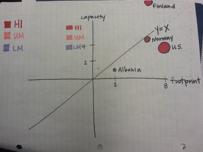
Taylor and Lester plotted footprint (per capita) against capacity (also per capita), which meant that a country falling above the y=x line has a resource surplus and a country below the line has a resource deficit. I thought that was a great way to highlight a key story in these data. I asked this group why they chose to use bubble size to represent population. That’s what Hans Rosling did, and their initial answer (“To put more data on the graph?”) told me they hadn’t thought this choice through very well. It’s a smart move, however, since bigger countries running deficits have bigger impacts on the global ecological footprint, and that impact is made visible by bubble sizes on the chart. I think I convinced these two students that putting more data on the graph was good, but having a particular reason for doing so was better.
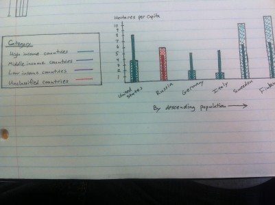
Jack tackled the deficit / surplus story differently, representing footprint and capacity for each country by bars of different widths and patterns. When the thinner, solid-colored bar rises above the wider, cross-hatched bar, a country has an ecological deficit. When the wider bar is taller, the country has a surplus. This makes it easy to compare different countries.
Siana and Tim took an approach similar to that used in the first visualization above, but they added a visually interesting graphical element to their chart. The size of the bubbles still represents population size, but in this case the bubbles are shaped like people and adorned with national flags. This makes it easier to figure out that size represents population, while also aiding identification of individual countries on the chart.
Check out my summary post over on the course blog for a few more examples, including a use of something much like the polar-area diagrams used by Florence Nightingale. I’m hoping this activity will help students appreciate the data visualization techniques we’ll address in the next few class sessions. I’ll probably have them take on this same challenge again in a week or two to see how they can improve on this first pass at it.


