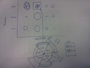
Thanks for the enthusiasm and creativity you brought to the visualization activity today, and for your willingness to break out your phones during class in an entirely on-topic kind of way. Here are a few of the ecological footprint data visualizations that were submitted that I thought were particularly interesting.
(Click on any of these to see a larger version.)
 Here’s the one from Curtis and Hayden we discussed during class. The approach they used with circles is similar to the polar-area diagram, a visualization technique first used by Florence Nightingale (the famous nurse) to describe the kinds of deaths that occurred within the British Army during the Crimean war. Here’s Nightingale’s polar-area diagram:
 It makes pretty clear that the Russians weren’t the real enemies during the war. Nightingale’s data visualization led to changes in military field hospital procedures used by the British Army. Read more about Nightingale, who was trained as a mathematician before entering nursing, here and here.
 Here’s a visualization I didn’t show on the big screen, this one from Taylor and Lester. As with most of the other visualizations, they focused on the issue of resource deficits. They went with a standard set of coordinate axes, with footprint on the horizontal axis and capacity on the vertical axis. This gives the line y=x particular significance: countries above the line have more capacity than they’re using and countries below the line are running ecological deficits. Population is represented by bubble size, which adds more visual meaning, since more populous countries contribute more to the global ecological footprint. Albania may be running a deficit, but the United States’ deficit has a bigger impact. Color is used to indicate income group. (Also of note: Taylor had a set of multi-colored Sharpies with her. Very handy.)
 Here’s another visualization that uses color to represent income group. This one is from Jack, and he took an interesting approach to the challenge of representing deficits and reserves. Each country’s footprint is represented by thinner, solid-colored bar above the country name. That country’s capacity is represented by the wider, cross-hatched bar that appears “behind” the footprint bar. Clever and easy to read.
 I mentioned during class that I didn’t see anyone taking a geographical approach to their visualizations. I clearly didn’t see this visualization by Lauren (who worked with Chris, I think), which takes an abstract approach to geography. The deficit / reserve ratio is pretty clear here, although I’m not sure what the size of each circle means. Is it the number of hectares per capita? Or are the circles scaled by land mass or population, as well?
 Here’s a visualization by Kasey and Megan. They tackled the multiple-kinds-of-land-use challenge with stacked bar charts, which works well, and they dealt with their lack of colored Sharpies nicely. Their decision to put biocapacity above a horizontal line and footprint below was one used by several of you. It works, but not great. It makes it a bit hard to tell if a country is running a deficit or surplus.
I’ve saved the best (at least in terms of visual appeal) for last:
 This one is by Siana and Tim. Their approach is similar to that of Taylor and Lester above, with coordinate axes for footprint and capacity and bubble size for population. What Siana and Tim have added to this is a couple of different sets of well-designed bubbles. At the top, you’ll see they started with circles (as usual) with country flags for easier identification. I’m guessing that was nice, but not visually interesting enough, so they went with people-shaped bubbles for their second visualization, keeping the country flags in the mix for identification. The people-bubbles don’t add any information to the visualization, but they’re a nice design element and they communicate the idea that size represents population more quickly than the circle-bubbles do.
Finally, here’s the interactive visualization of footprint data that I showed in class today.


